Pottery Barn Website Redesign Case Study
Intro
Role: Lead Designer
Tools: Sketch, Pen and Paper, Xtensio, UXPressia, LucidChart, Invision, Post-its, Note Cards
Intro: Pottery Barn is an upscale furniture chain that sells home goods ranging from bed and bath to tableware and lighting.
Goals:
To research user goals and pain points to facilitate better design and interface.
To simplify and streamline the current Pottery Barn website to assist users to better meet their goals faster and more effectively.
Research
User Interviews & Initial Testing
Through user interviews I came across three major pain points:
The navigation has too many options and is confusing
The drop down menu is overwhelming and difficult for the user to find what they are looking for
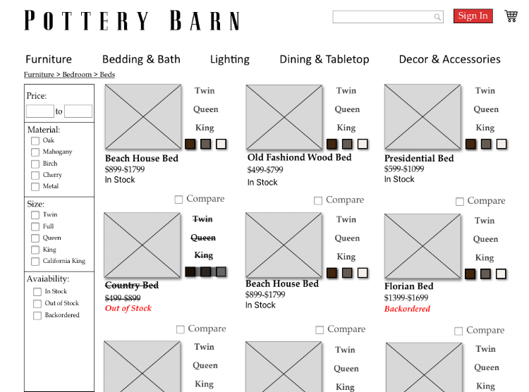
Product availability information not available upfront
Comparative & Competitive Analysis
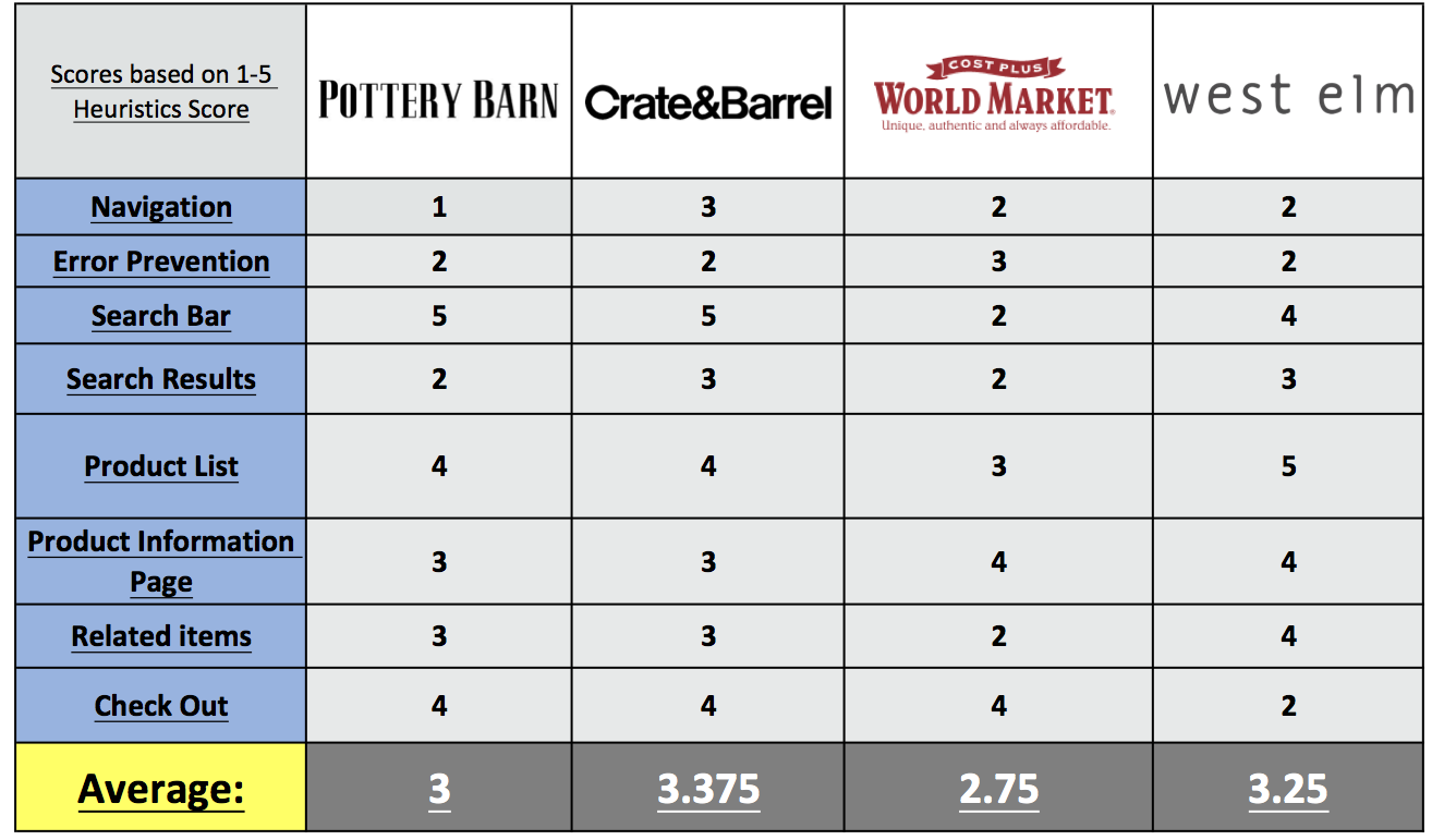
As I studied Pottery Barn’s peers, I noticed a clear pattern: Despite being on par with competitors and peers in many categories, the site suffered overall because of poor navigation design and organization. It was clear to me that I needed to focus my redesign on the navigation, information architecture, and overall user flow.
Persona
Based upon surveys and user tests I developed the persona of Rachel to help me focus my redesign.
Rachel is a grad student who recently moved to Los Angeles. She is looking to get settled in her new apartment before her classes and new job start.
Information Architecture
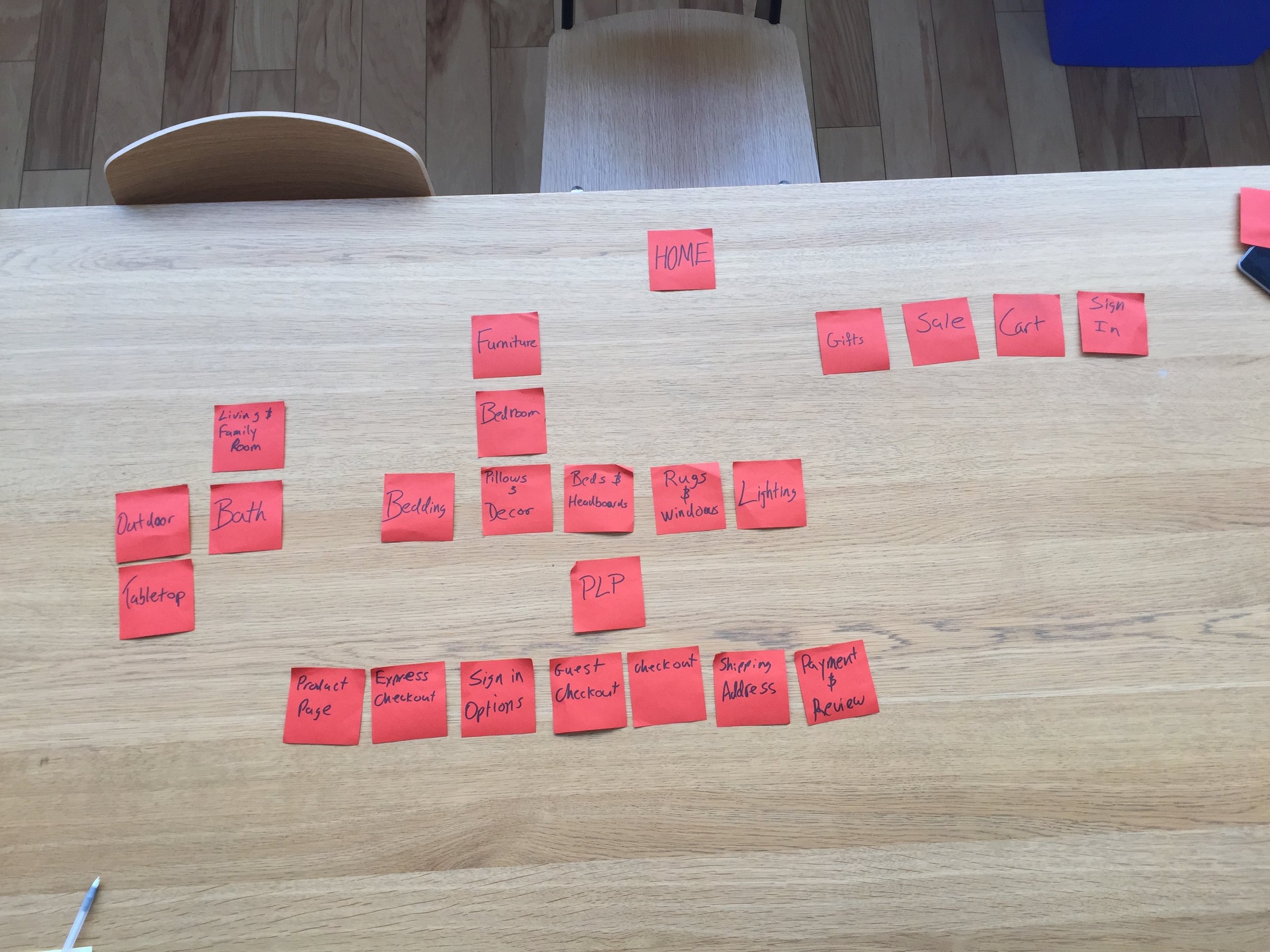
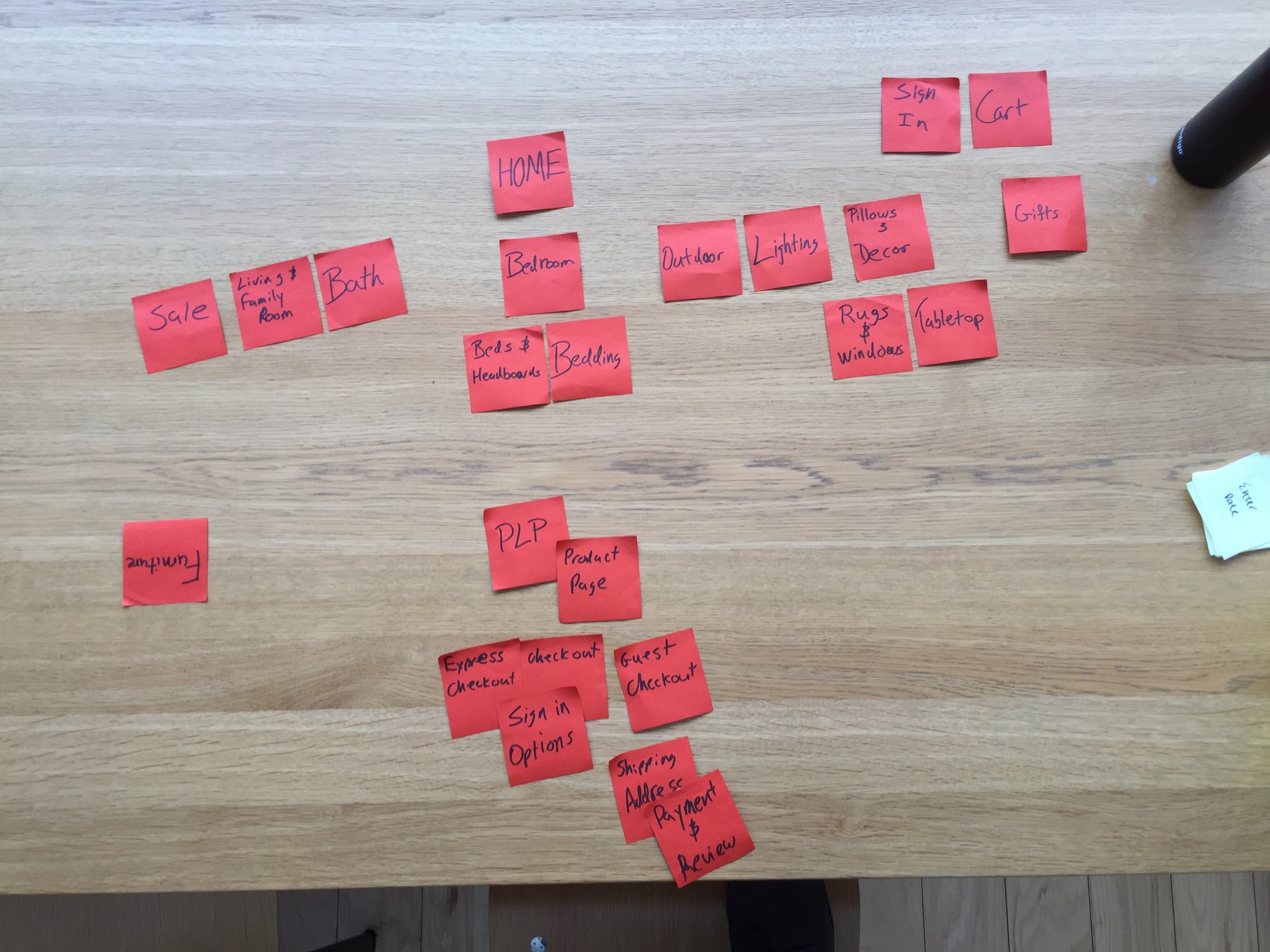
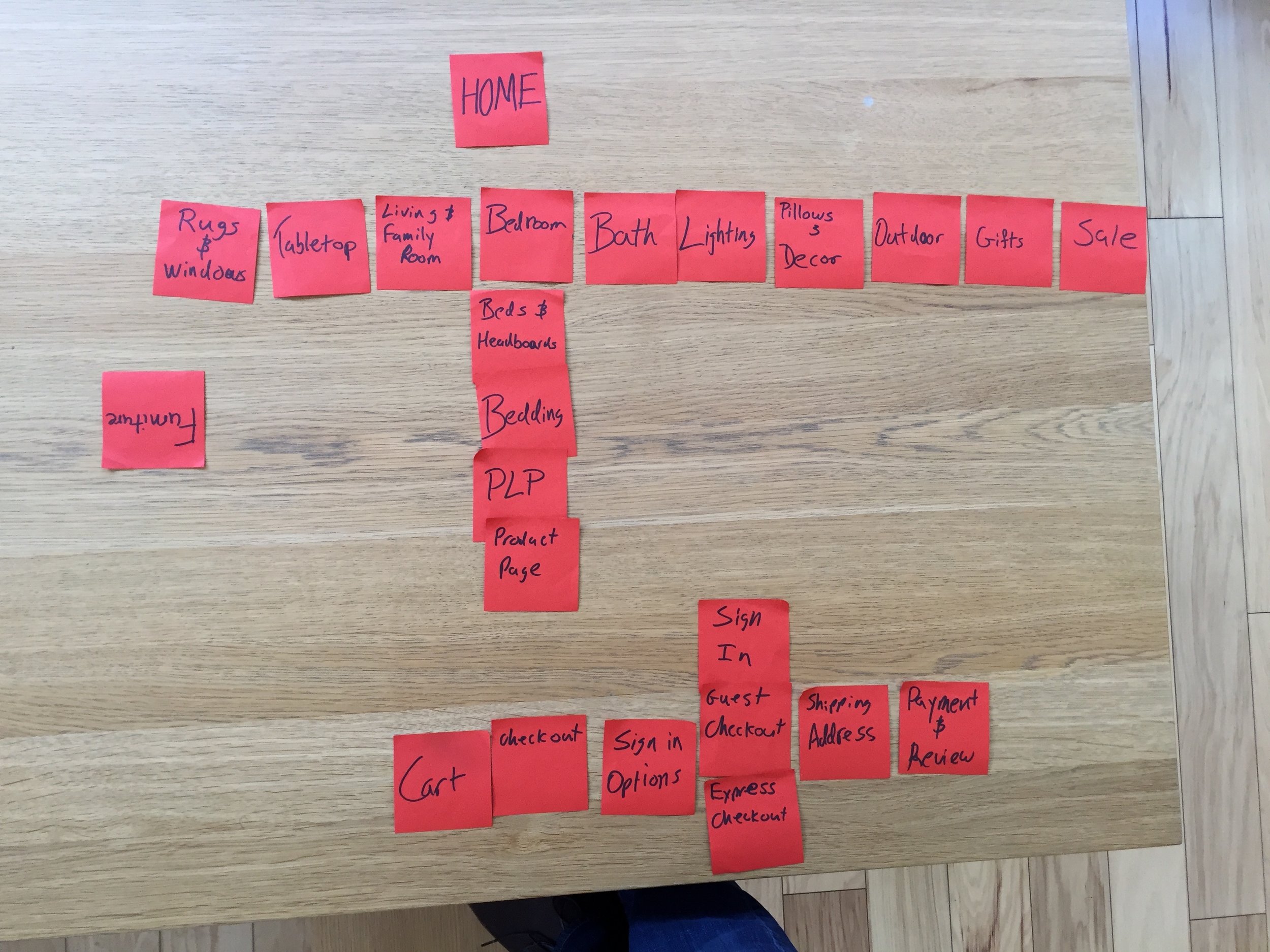
Card Sort
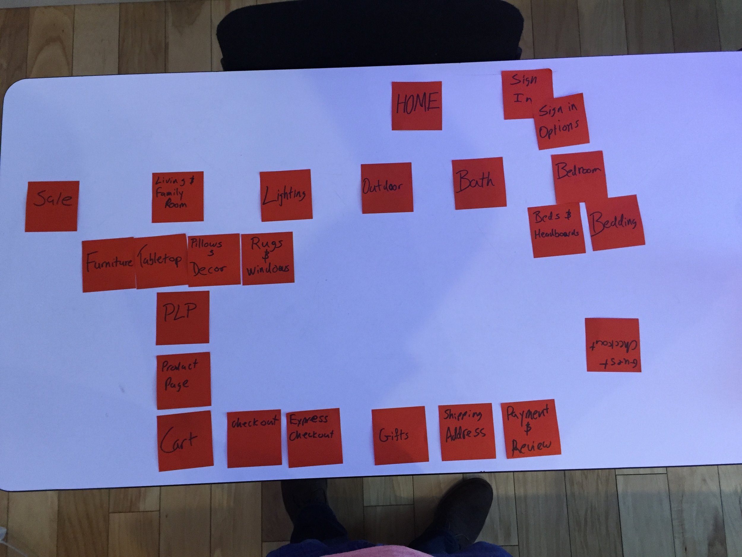
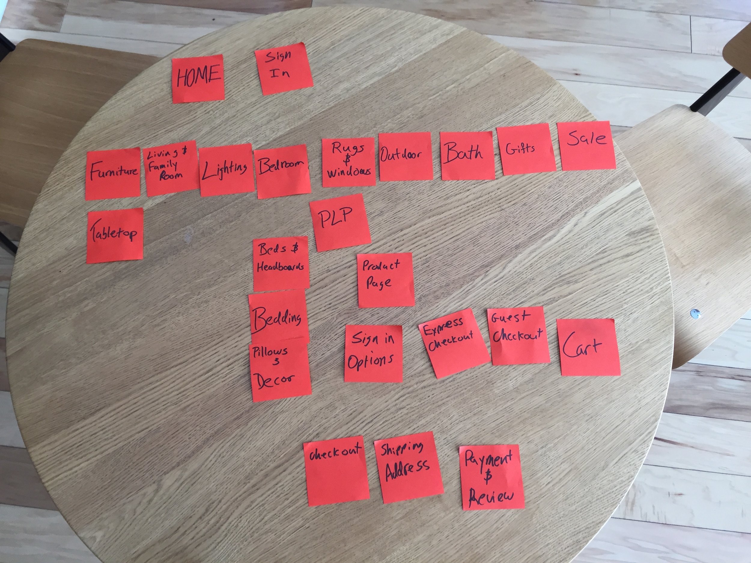
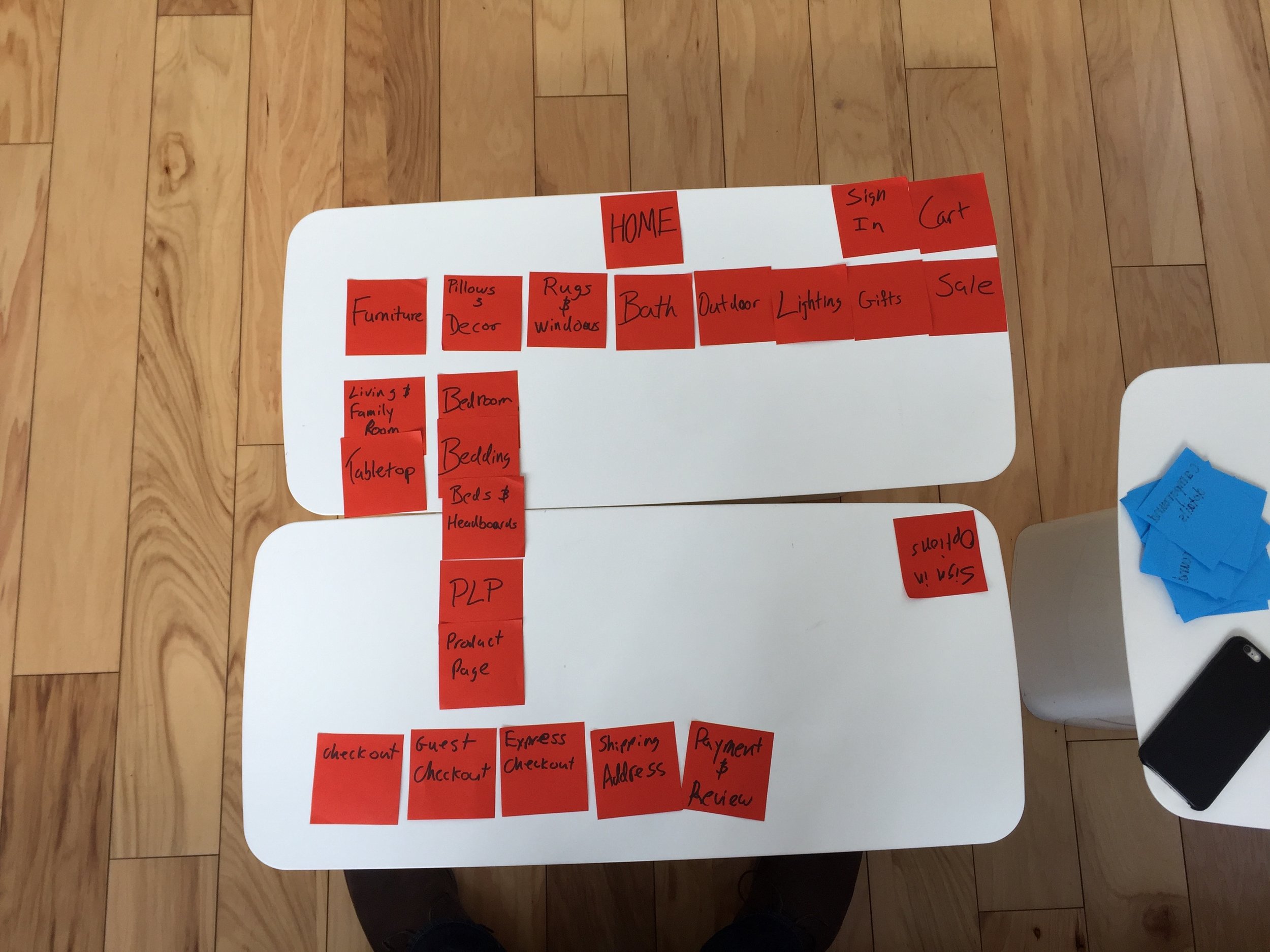
Card sorting revealed deep confusion with the multi-step checkout process currently utilized by Pottery Barn. Not only was there a Member Checkout and a Guest Checkout, but there was a Standard Checkout and an “Express” Checkout as well. All of this told me that the checkout flow would also need serious revision.
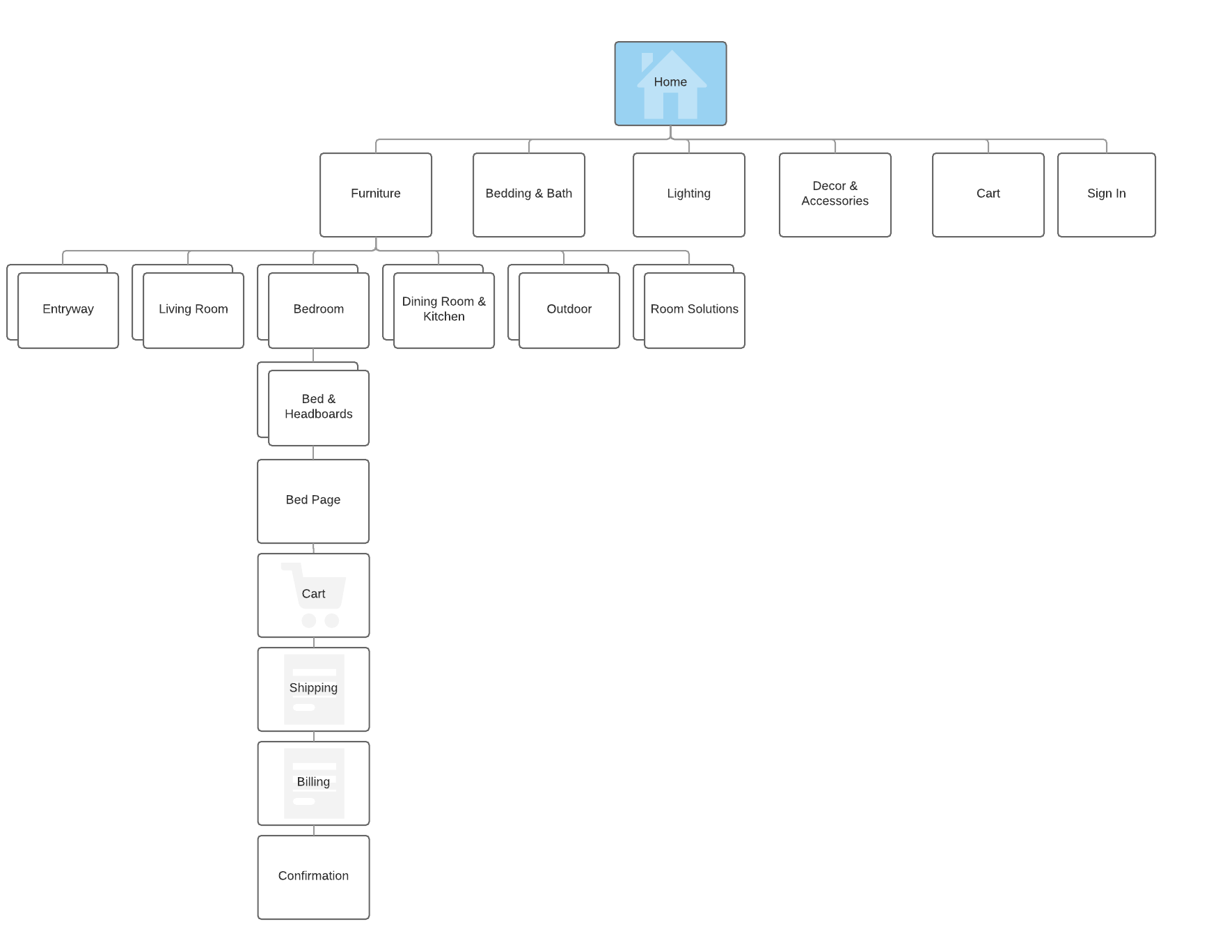
Site Map
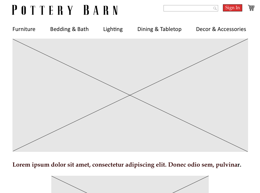
Based on research and cart sorting I reduced the main navigation from 10 options to 5. Reducing the options reduced confusion among users and made it easier for them to find what they were looking for.
One of the major pain points encountered through research and testing was the number of steps needed to move through the website and checkout. By eliminating the superfluous “express checkout” option I was able to reduce the necessary steps from 16 to 8.
Design
Sketches
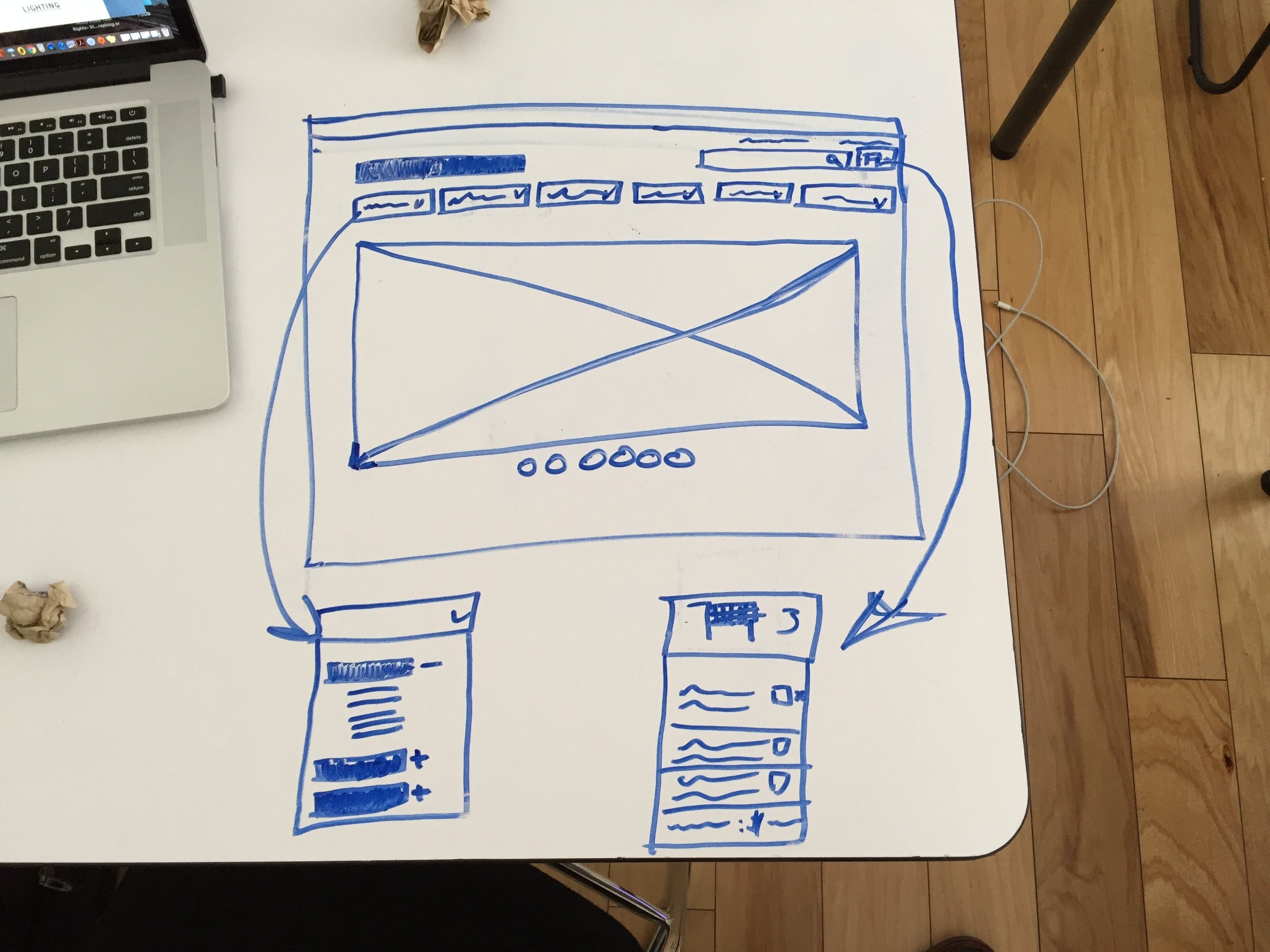
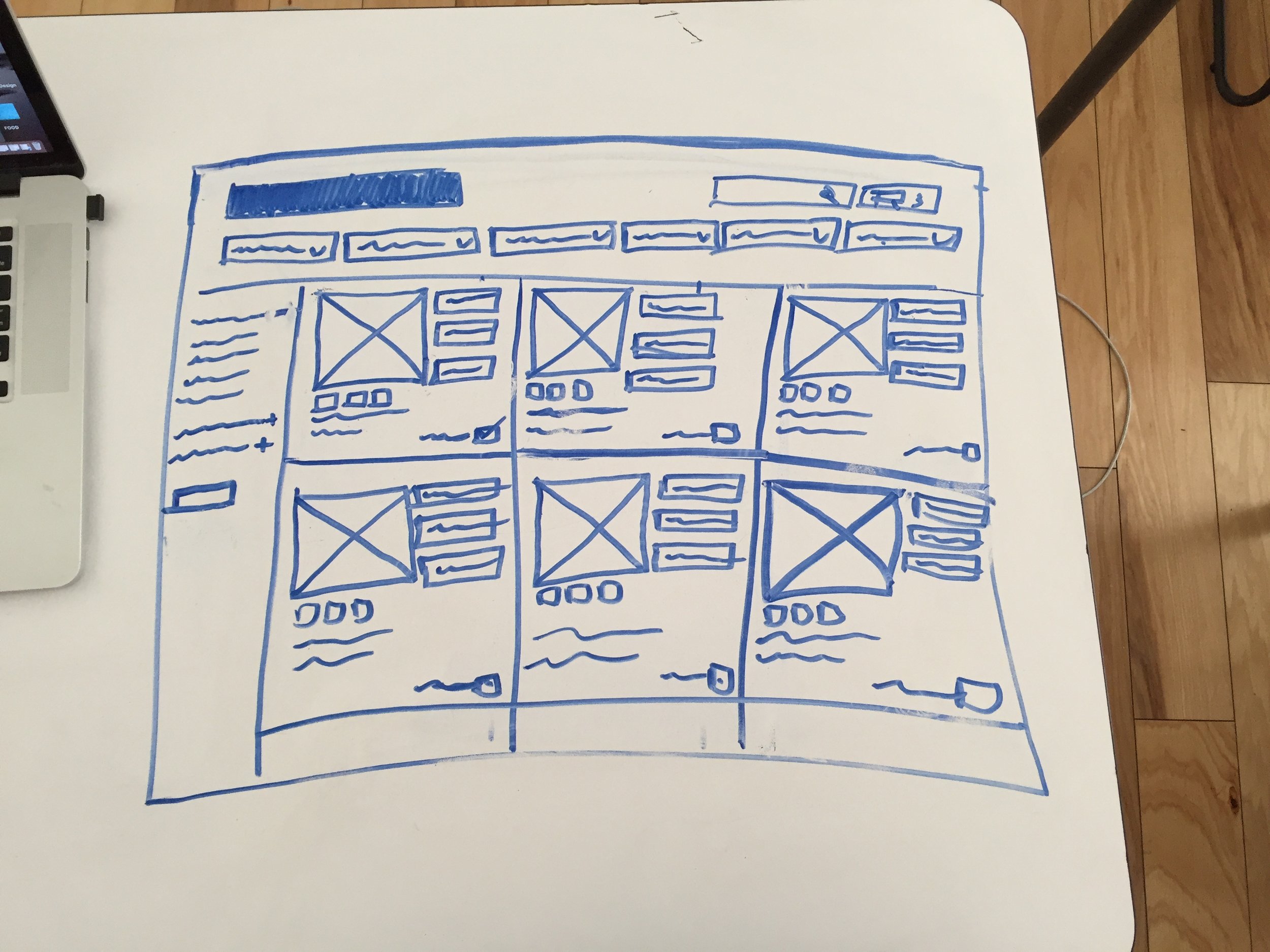
Once I knew I needed to reduce the menu size I wanted to focus on the actual interaction design of the menu itself.
Instead of having a large menu that takes over the entire page, I wanted to build something smaller and contained to each category. That way users can browse the items in the Furniture section for example, and not have to be bombarded with subheads from the Lighting or Dining & Tabletop sections.
Wireframes


