MedRepublic
Intro
Role: Project Manager
Tools: Sketch, Pen and Paper, Xtensio, Invision, Post-its, Note Cards, Google Analytics
Intro: MedRepublic is a Los Angeles based company that connects patients with affordable and high quality healthcare abroad.
Goals:
- Increase conversions from users who simply view a doctor profile to actually following through and contacting a doctor.
- Increase traffic of higher quality users to the website
- Improve overall usability
Research
Review of Current Site
The team's initial review revealed several key issues:
- While watching user testing videos we noticed that users had trouble noticing the search bar because of the drawings and speech bubble on the right.
- The site lacked clear calls to action on multiple pages, especially in the search results where users can see an overview of available doctors
- The contact button on the doctor's profile page was below the fold, thus making it more difficult to complete their task.

Comparative & Competitive Analysis
As my team studied MedRepublic's peers, we noticed a clear pattern: Despite offering a great service, the current website did not emphasize the strengths of the business or even what made it better than its competitors.
That product and services MedRepublic already provides has fantastic value but new users would not necessarily know that from a brief visit to the website. Our goal became to learn from other sites and design a product that would best represent that high value of MedRepublic.

Information Architecture
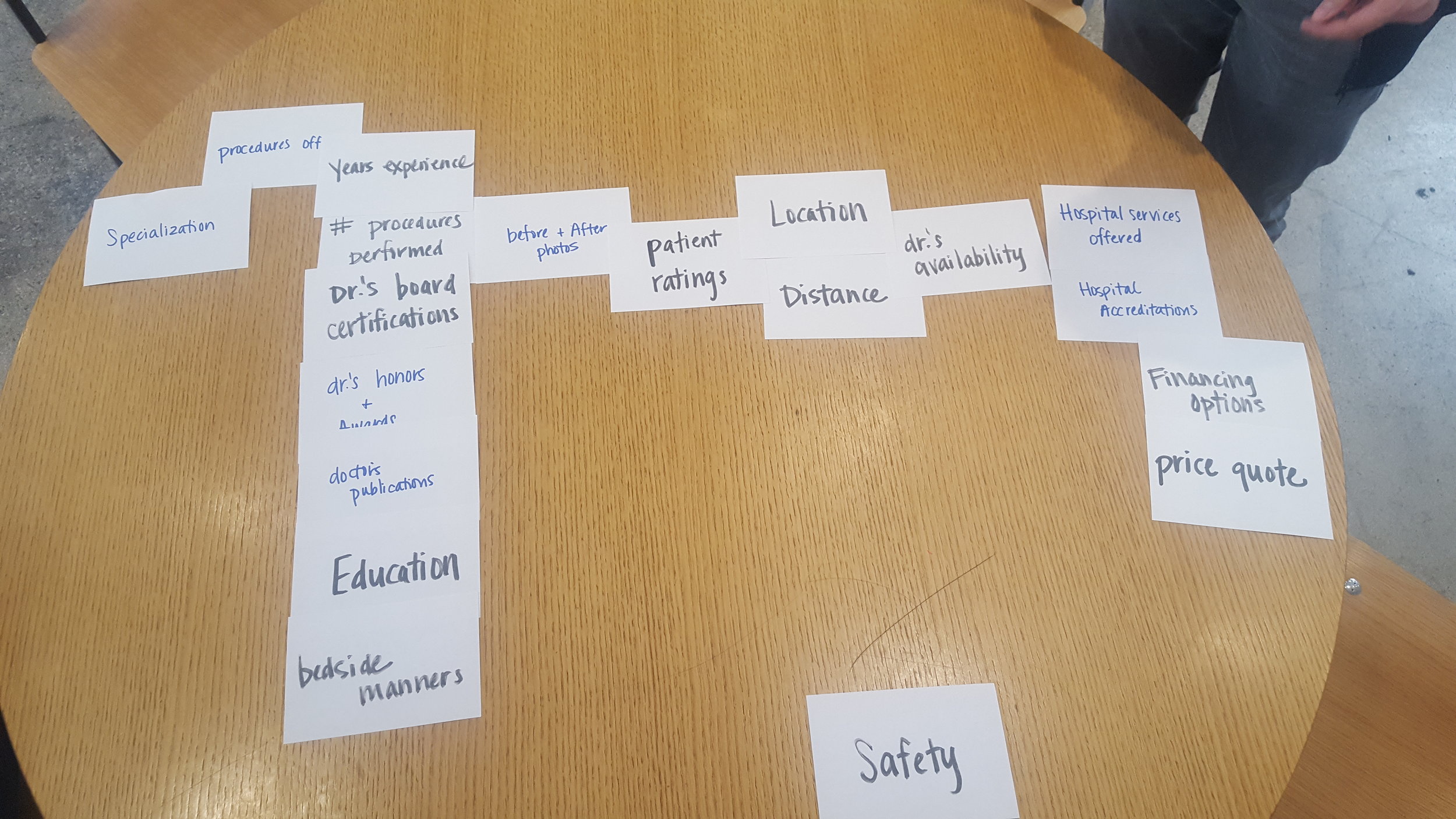
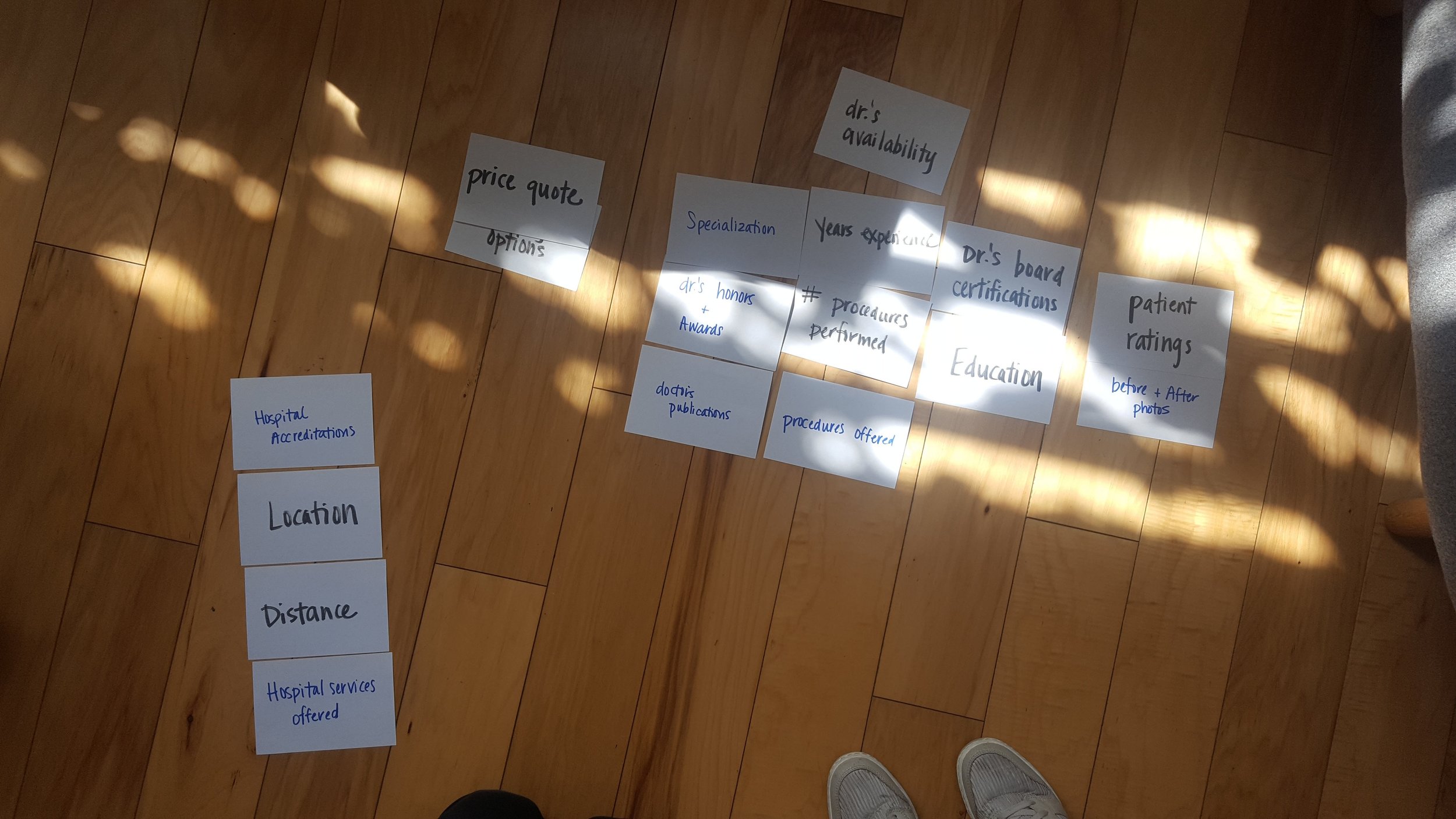
Card Sort
Our primary goal with our card sorting was to determine what information users would prioritize when searching for a doctor.
We made the assumption that education would be a top priority for users and were surprised to see that patient reviews were consistently a top answer among those we tested.
After patient reviews, we then discovered that the doctor's background and training were also very important to user's potential decision making but it would be something they looked for after finding a doctor with good reviews.
Design
Sketches
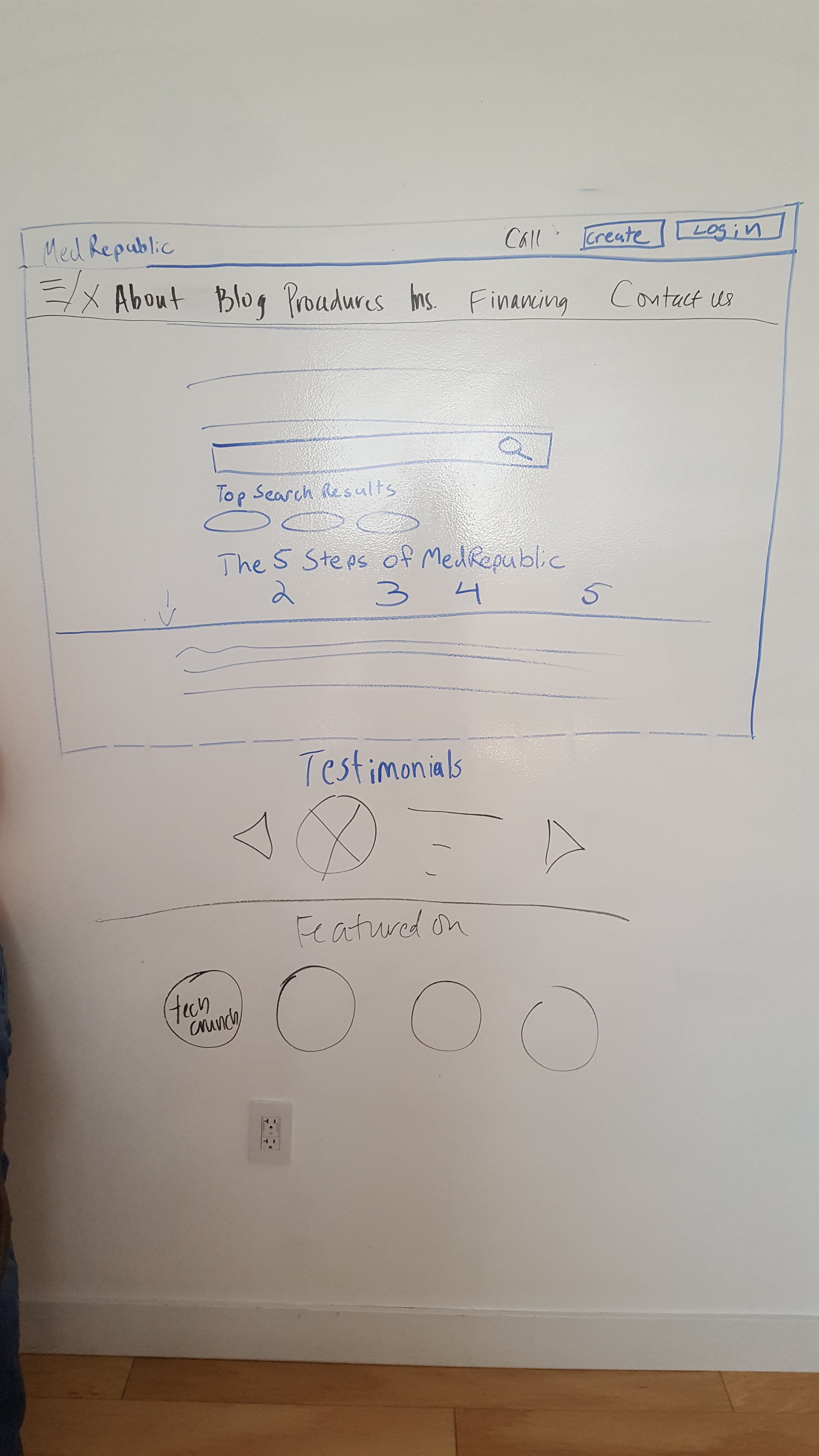
In the early sketches my team and I set out to improve various aspects of the site.
The navigation was a major focus of our redesign. The navigation originally slid in from the right side, which confused people in our testing. So we moved the navigation from the right side to the top of the page, a much more familiar placement to most users.
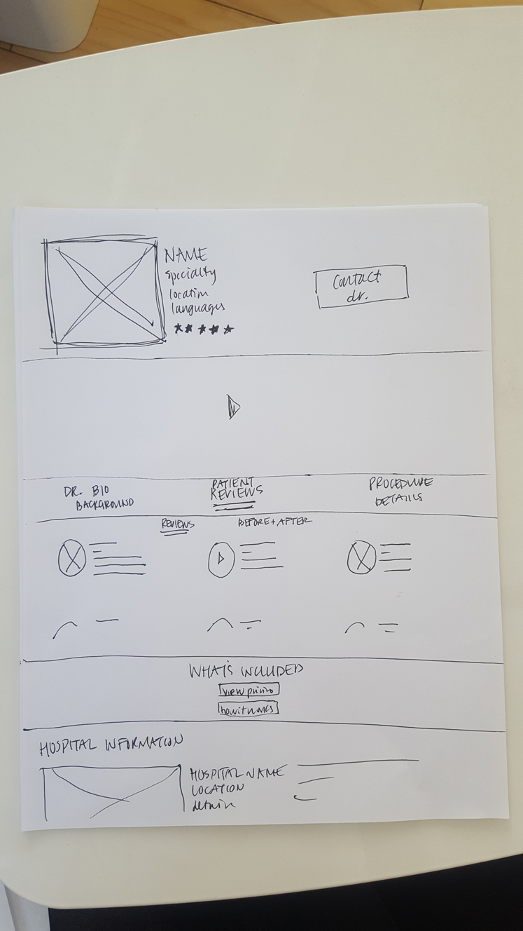
The original profile pages for the company's doctors had good information but it was not easily accessible or simple to find. Our goal during sketching was to restructure the page and make the information easier to find for our users.
Wireframes
When we moved onto the search results page we used our testing and research to find the information about the doctor that our users wanted to know first. Once we knew what they expected and wanted to see, we organized it in the order our users most wanted to see it. The most important thing users we tested and interviewed wanted to see was the reviews of the doctor from former patients.
We took a similar approach when we were flushing out the details for the doctor's profile page. We needed to use our research and emphasize the
Search results
Doctor Profile

Mockups
The main focus of our final redesign for our homepage was to simplify the layout while maintaining the style and spirit of the original design. We took their original key colors and used them to make a bolder and enticing interface to bring people in and make them want to stay and explore.
With the final design for the search results it was clear from the research that one of the most effective changes we had to make was to make clear calls to action to view the doctor's profile. We changed the text on the button from "Learn More" to "View Doctor Profile." Our testing found the latter phrase to be a much more effective call to action and helped move our users further through the site at a point where many were dropping off and leaving the site.
Home Page
Search Results