Samsung Family Hub Fridge Companion App -
Case Study
Intro
Role: Product Manager
Tools: Sketch, LucidChart, Smartsheet, Xtensio, Whiteboard, Pen & Paper, Marvel
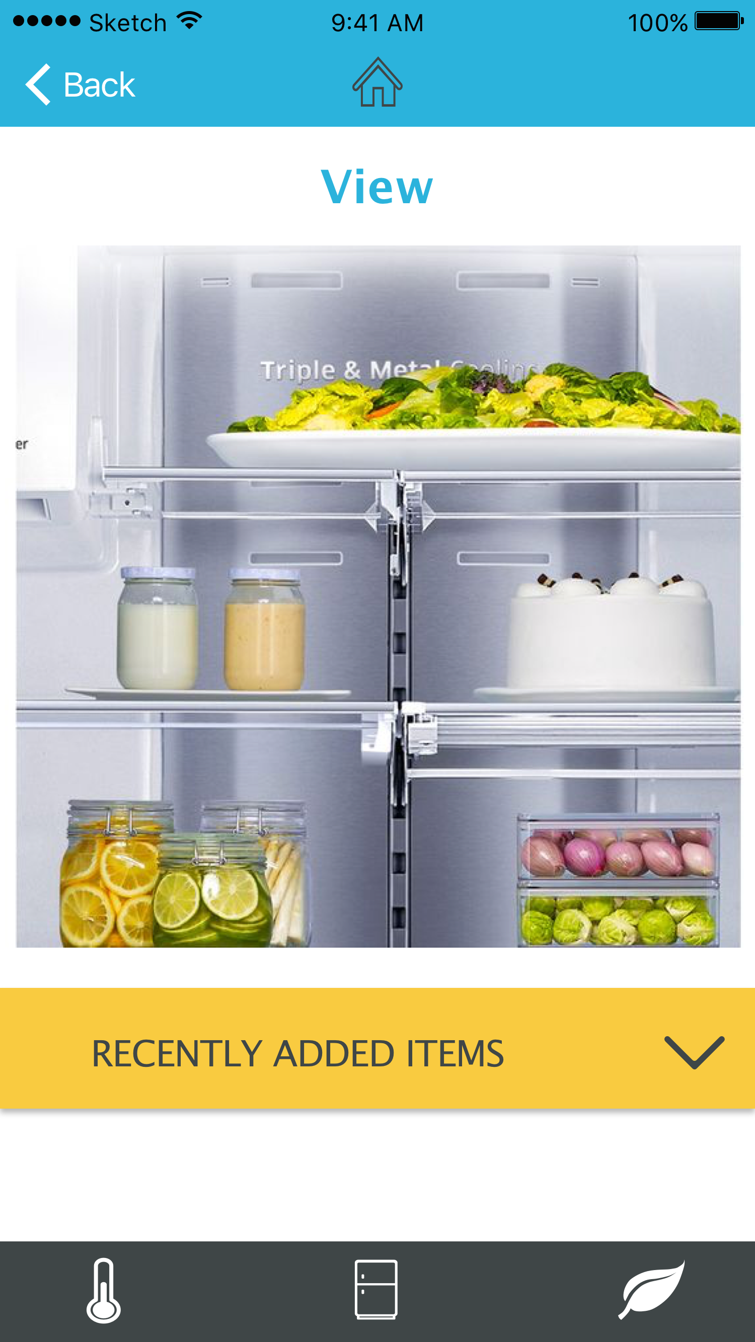
Intro: The Samsung Family Hub Refrigerator is the latest in smart home technology. The fridge itself has a multitude of features ranging from freshness indicators to Smart TV mirroring.
Challenges: The abundance of fridge features can be overwhelming to users who simply want to do a few select things while in the kitchen.
Goals:
Create a simple, clean app that gives users the best, most reliable tools to help them complete kitchen related tasks.
Research
User Survey
We surveyed over 130 people about their habits relating to cooking, grocery shopping, and use of smart home technology.
- 60% of respondents said that at least 1/4 of the food in their fridge has gone bad
- 70% use recipes and 30% cook exclusively from recipes
- 61% said they liked smart home devices or were curious to learn more about them.
These insights allowed us to narrow our focus as we moved onto more in depth interviews in order to identify our primary user.

User Interviews
We designed our interview to obtain as much information as we could about the pain points that we discovered in our survey.
From our interviews we were able to determine that our primary user was over 30, has a full-time job, and enjoys cooking even though it can often be stressful to plan.
We also found that most of the people we interviewed were interested in using technology to help them plan meals while also wasting less food.

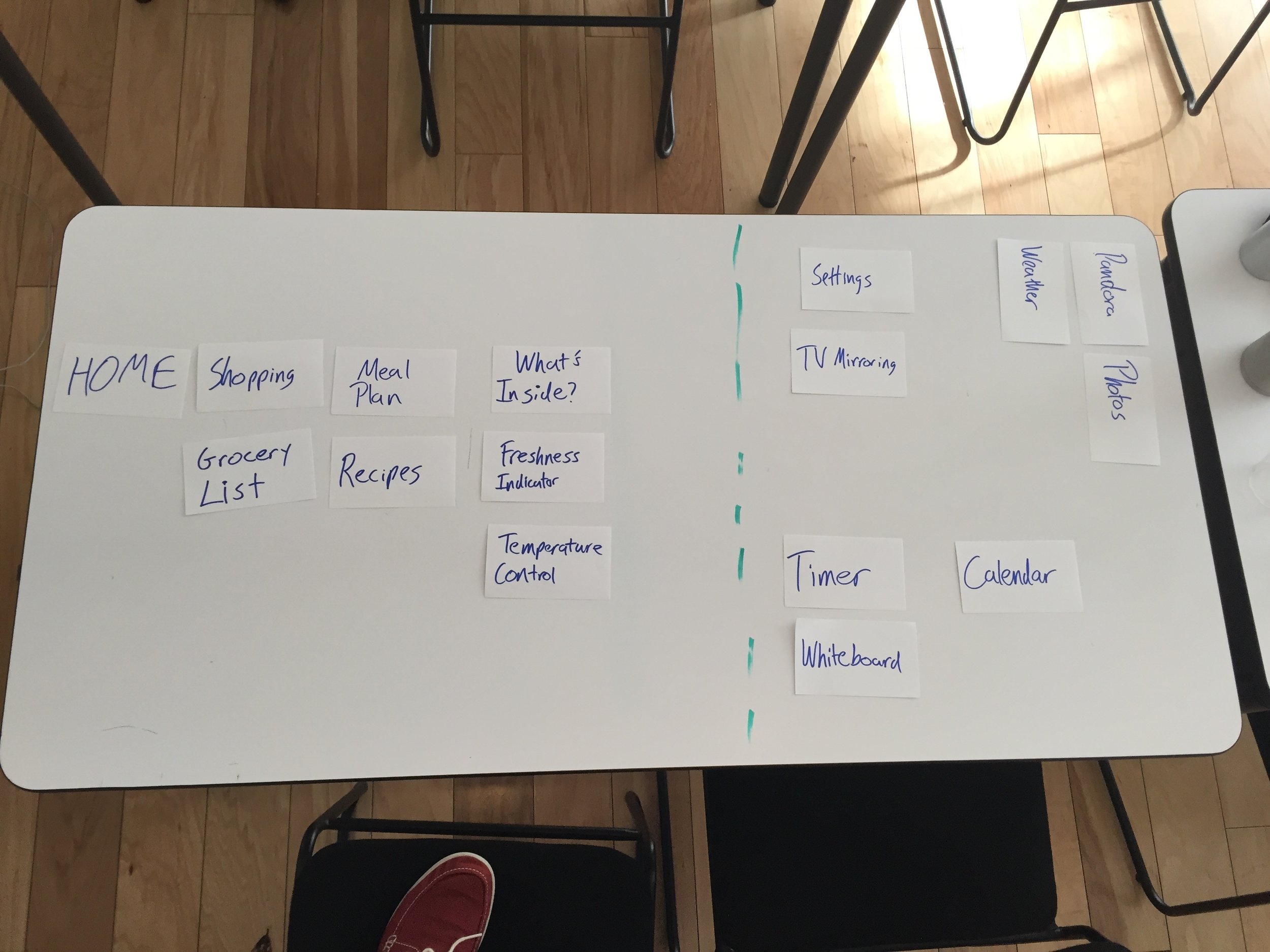
Information Architecture
Card Sort
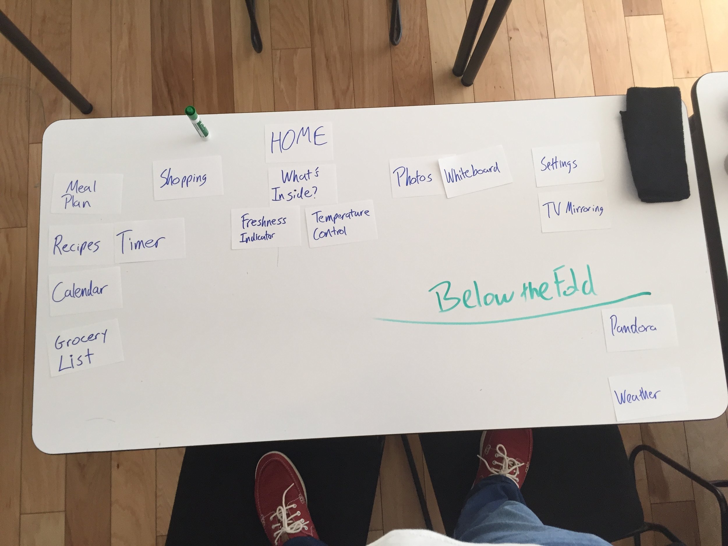
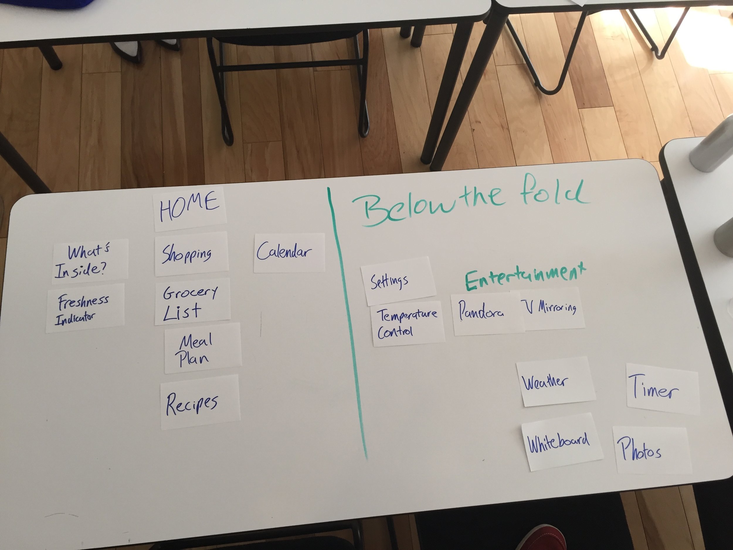
Because of the vast amount of features currently available in the Samsung fridge, we decided to do a card sorting exercise to determine which features users would prioritize the most.
The exercise confirmed that users wanted to be able to use the app to assist them while they cook and to help them find recipes in order to plan meals.
Although the additional features such as playing music through Pandora had appeal, the users we tested found that features like that were better left either below the fold or out of the app entirely so they could focus on their primary tasks.
Design
Sketches
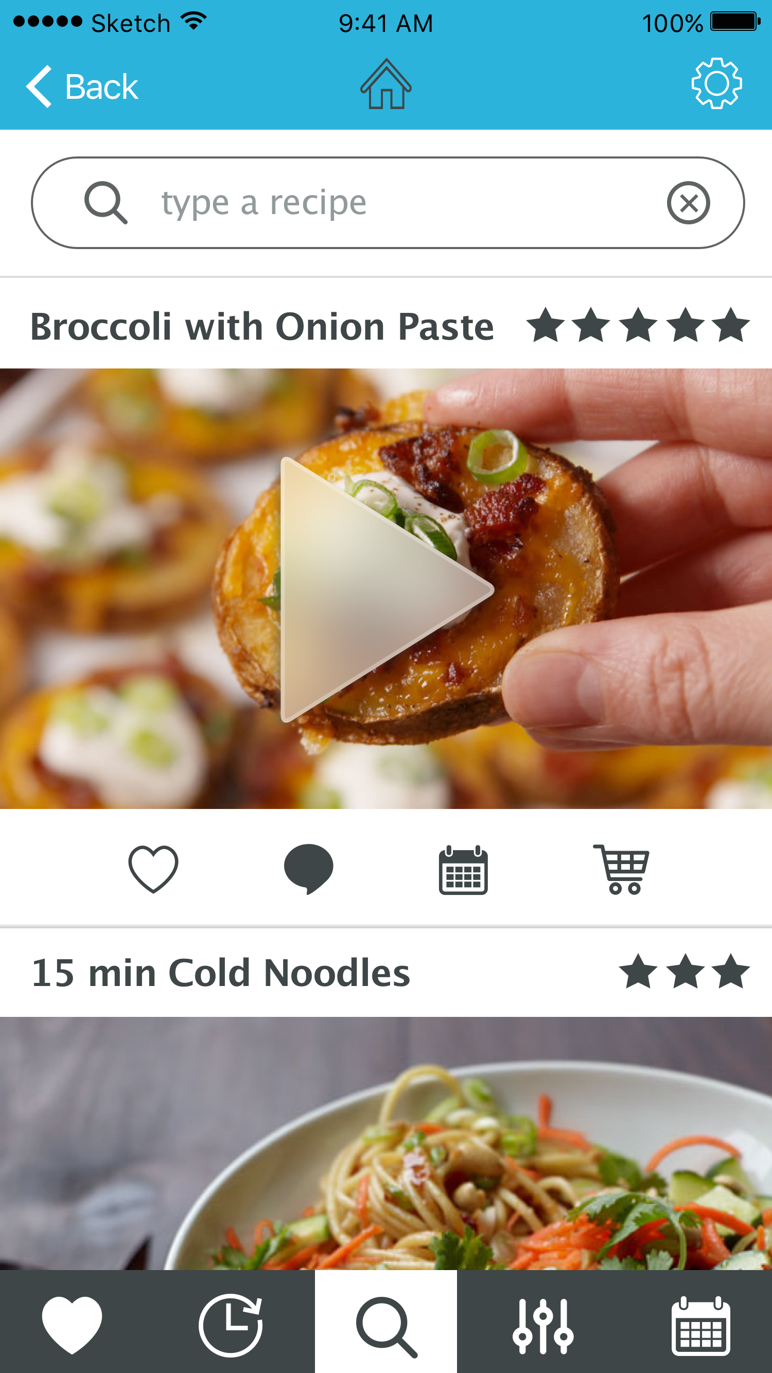
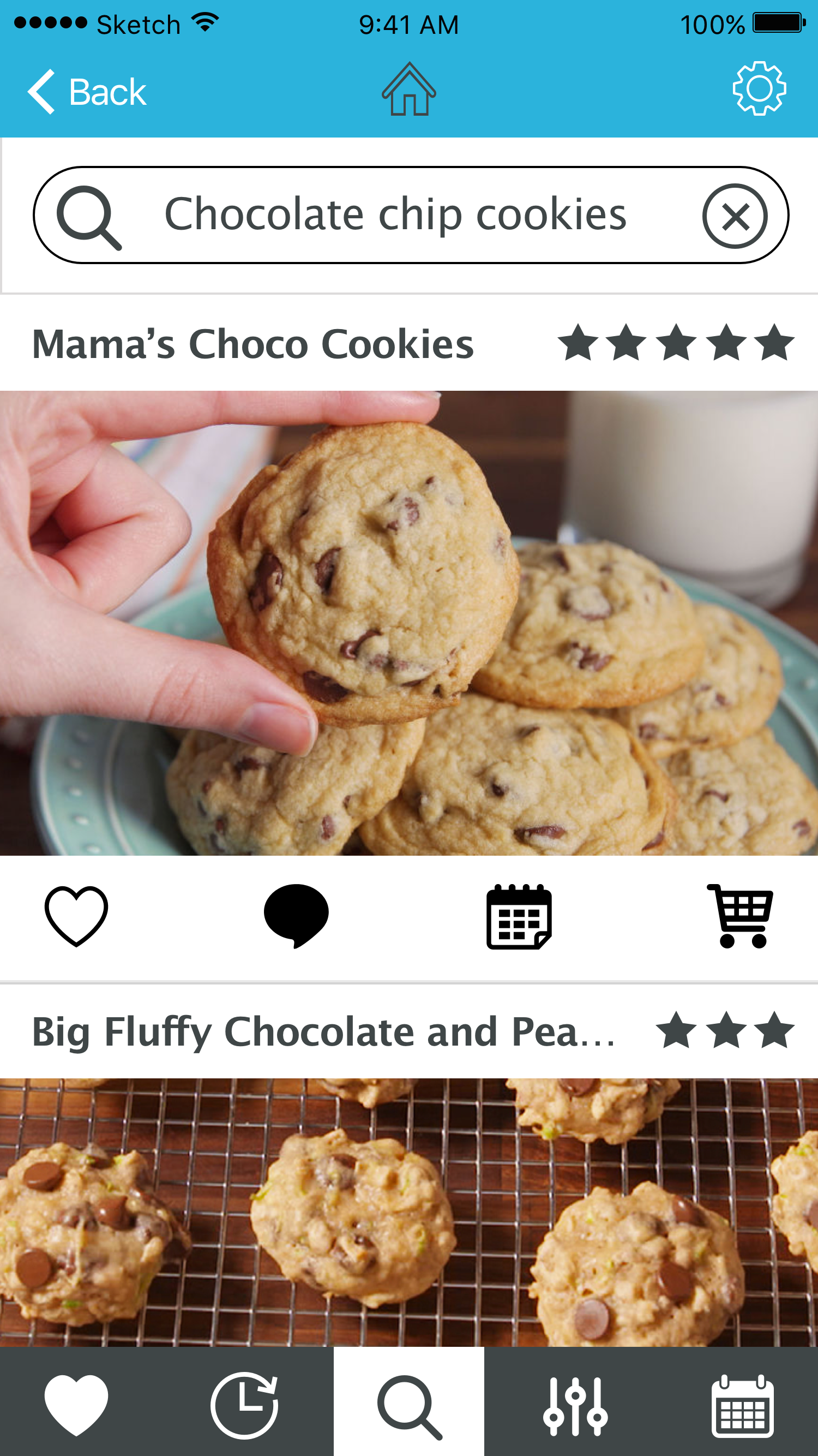
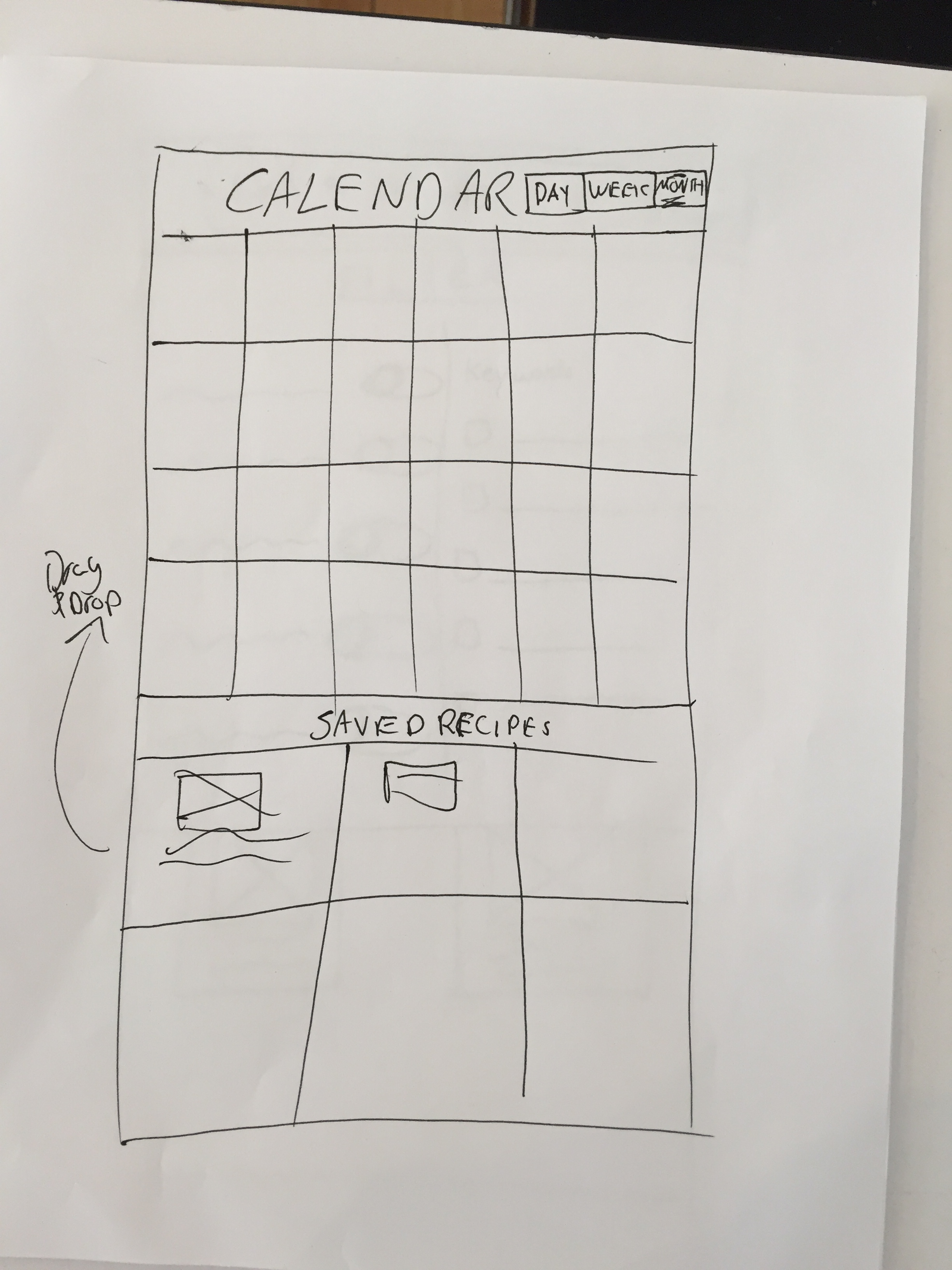
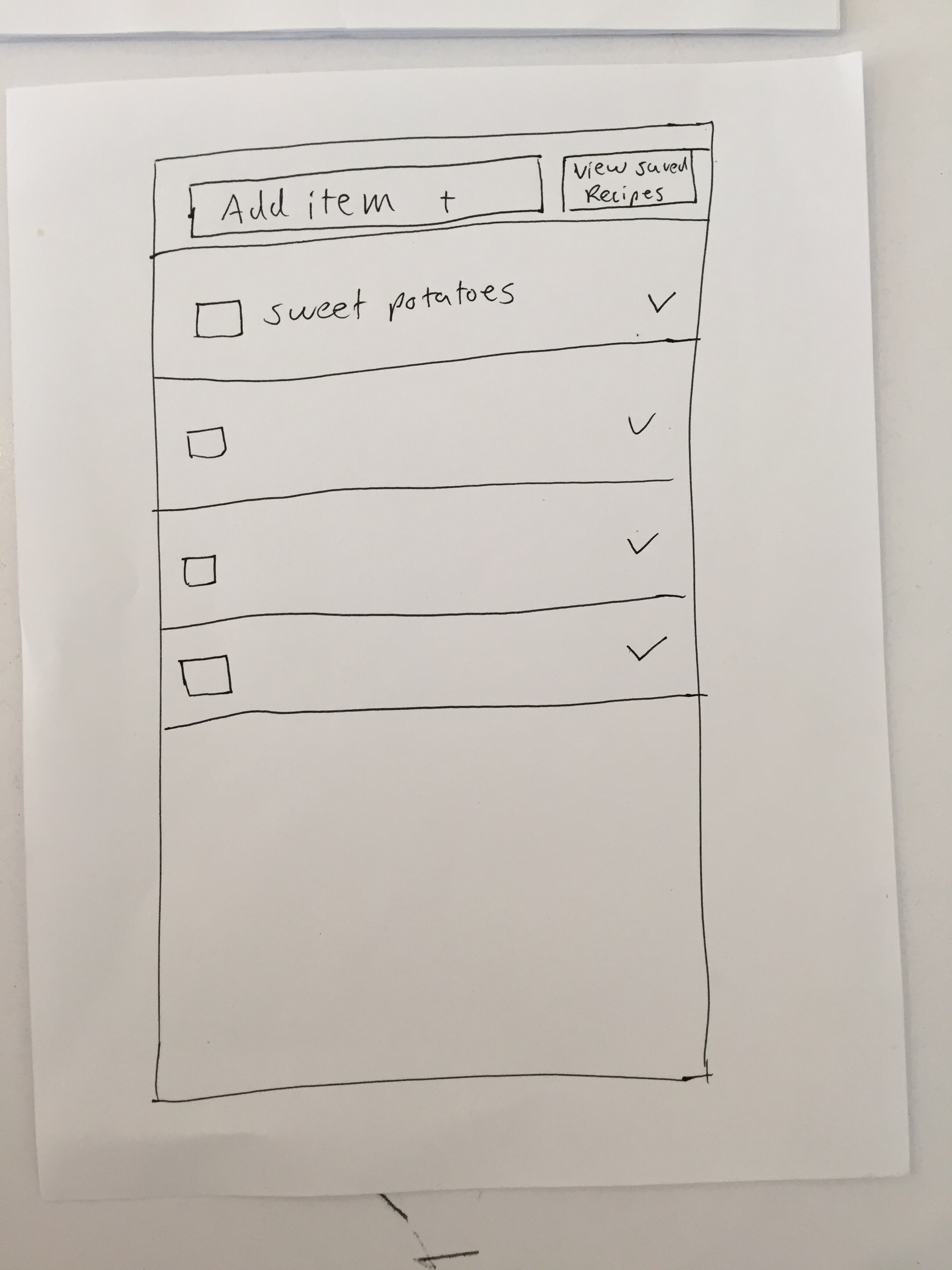
Two of the main features I wanted to focus on while designing was the calendar and the grocery list.
These two features were essential to creating an app that would help a busy user keep their meal planning organized and easy to access.
Mockups
While designing the high fidelity mock ups, I wanted to ensure that we focused on a simple color scheme, but also made the app feel consistent with Samsung's already existing branding.